- Icon Monks
- Design icons
- Corner Top Right
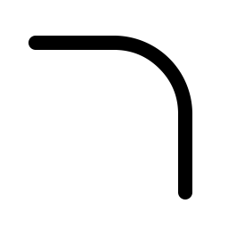
Corner Top Right icon
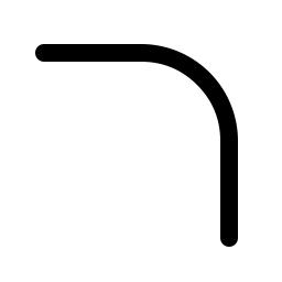
A free corner top right icon from the Design set, useful for rounded corner, corner radius, border. It comes in six weights and is free for personal and commercial use under the MIT license.
Open in the icon browserCustomize size and color, then download PNG, WebP or PDF.
Use the corner top right icon in your code
React
import { CornerTopRight } from '@icon-monks/react';

<CornerTopRight size={24} />
Vue
<script setup>
import { CornerTopRight } from '@icon-monks/vue';
</script>

<CornerTopRight :size="24" />
Web component
<icon-monks name="corner-top-right" size="24"></icon-monks>Icon font
<i class="im im-corner-top-right"></i>Flutter
Icon(IconMonks.cornerTopRight)SwiftUI
Image(iconMonks: .cornerTopRight)Compose
Icon(IconMonks.Regular.CornerTopRight, contentDescription = null)Need setup steps? See the getting started guide or the page for React, Flutter, SwiftUI or Jetpack Compose.
Tags
Related design icons
 corner-bottom-right
 corner-top-left
 corner-radius-top-right
 corner-bottom-left
 corner-radius-bottom-right
 corner-radius-top-left
 corner-round
 inner-shadow-top-right
 rotate-top-right
 corner-radius-bottom-left
 align-right
 align-right-simple
 align-top
 align-top-simple
 distribute-horizontal-right
 distribute-vertical-top
 inner-shadow-bottom-right
 inner-shadow-right